
Overview
about the client
Twelve24, a subsidiary of E Ink Corporation, was launched to develop new products showcasing E Ink’s ePaper technology. ClockONE, an ultra-thin, one meter wide digital wall clock, was their flagship product.
Twelve24, a subsidiary of E Ink Corporation, was launched to develop new products showcasing E Ink’s ePaper technology. ClockONE, an ultra-thin, one meter wide digital wall clock, was their flagship product.
MY ROLE
I was the Visual designer tasked with: design research: user profiles, competitive audit, design trend and product positioning analysis and visual design deliverables: Kickstarter one-pager, email blast templates and banner ads.
I was the Visual designer tasked with: design research: user profiles, competitive audit, design trend and product positioning analysis and visual design deliverables: Kickstarter one-pager, email blast templates and banner ads.
PROJECT GOALS
>>> To secure crowdsourced funding so ClockONE could be manufactured, packaged and shipped worldwide
>>> To see if Twelve24 could be a viable business venture for E Ink Corporation
>>> To secure crowdsourced funding so ClockONE could be manufactured, packaged and shipped worldwide
>>> To see if Twelve24 could be a viable business venture for E Ink Corporation
Challenge
WHAT PROBLEM DID I TRY TO SOLVE?
How do you raise brand awareness for a new company and their first product: a large, super modern, high-end wall clock with an MSRP of $600 USD?
How do you raise brand awareness for a new company and their first product: a large, super modern, high-end wall clock with an MSRP of $600 USD?
WHAT WAS MY DESIGN PROCESS?
>>> For the industrial design of ClockONE itself: compiled a competitive audit of similar products, developed potential user profiles and sourced product design trends.
>>> For the industrial design of ClockONE itself: compiled a competitive audit of similar products, developed potential user profiles and sourced product design trends.
>>> For the visual design of ClockONE campaign: Ideated and presented concepts, refined chosen design directions and implemented final designs.
Audit - Kickstarter Webpage Part 1/3
Audit - Kickstarter Webpage
REVIEWING THE CLIENT'S FIRST PASS
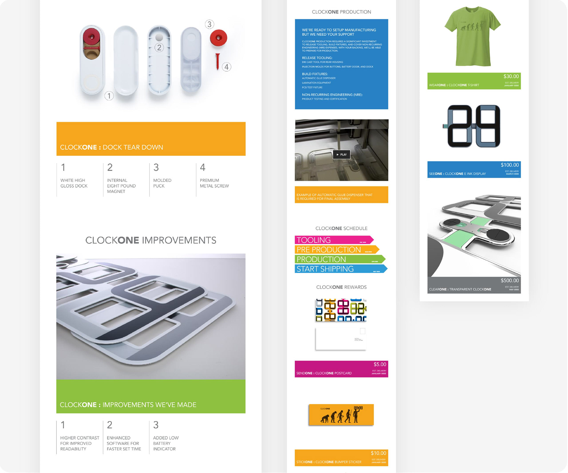
Working together with Twelve24, we audited their initial Kickstarter webpage attempt. Based on feedback and a review of brand guidelines, I made text and image refinements and uploaded final design files to the Kickstarter server.
Working together with Twelve24, we audited their initial Kickstarter webpage attempt. Based on feedback and a review of brand guidelines, I made text and image refinements and uploaded final design files to the Kickstarter server.
AUDIT FINDINGS
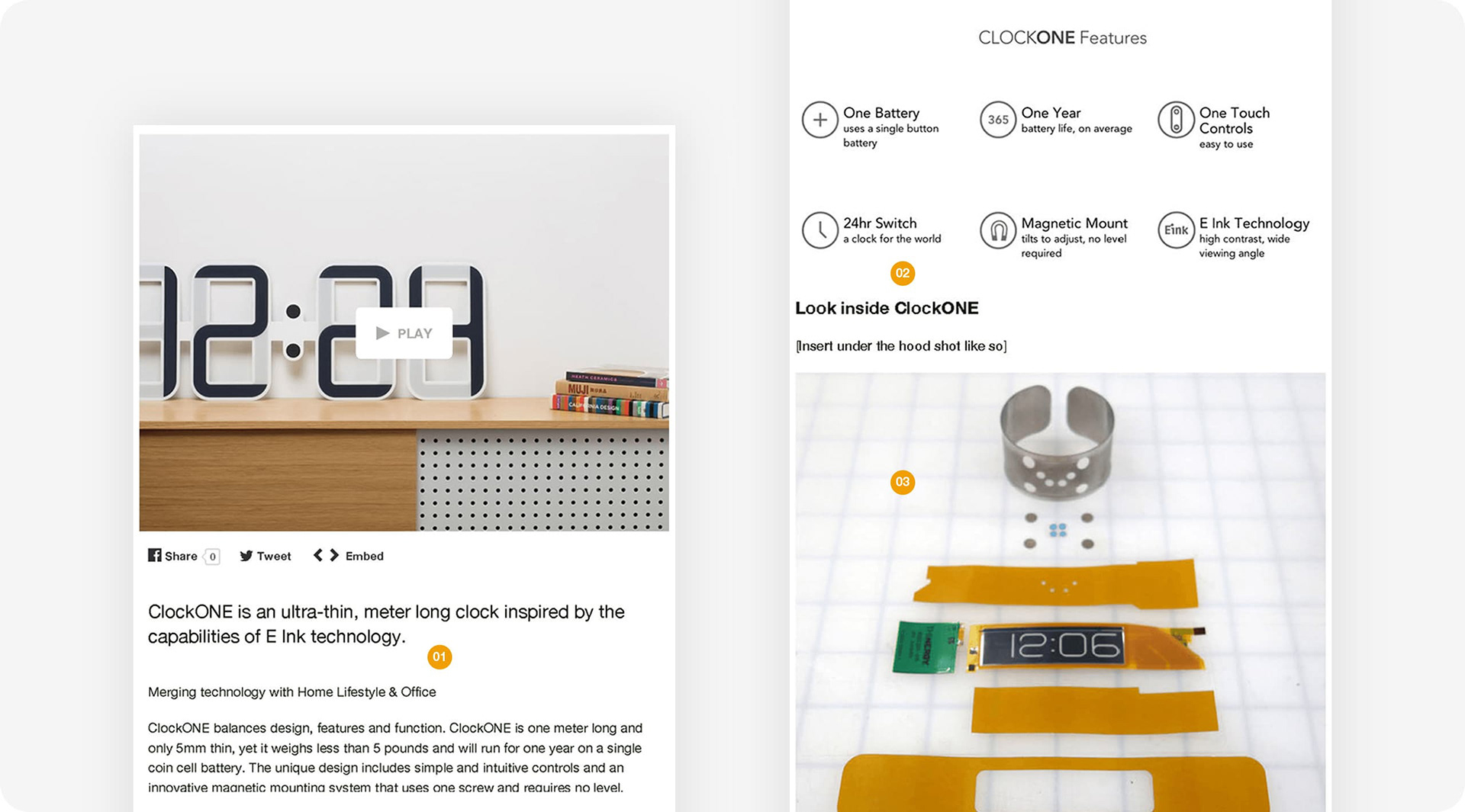
01 Incorporate ClockONE branding; think about how to show the ClockONE color palette
02 Include in-context images of ClockONE in home or office environments
03 Show the product backstory in a more visually interesting way
01 Incorporate ClockONE branding; think about how to show the ClockONE color palette
02 Include in-context images of ClockONE in home or office environments
03 Show the product backstory in a more visually interesting way
Audit - Kickstarter Webpage Part 2/3
Audit - Kickstarter Webpage cont'
AUDIT FINDINGS
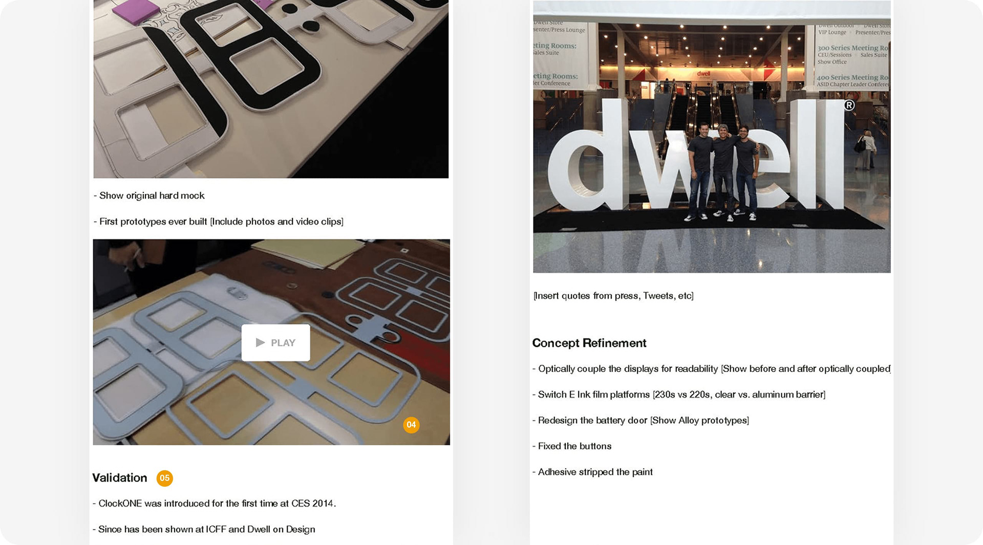
04 Talk about product improvements made during the design process
05 Discuss the manufacturing process; highlight readiness for product to go into production
04 Talk about product improvements made during the design process
05 Discuss the manufacturing process; highlight readiness for product to go into production
Audit - Kickstarter Webpage Part 3/3
Audit - Kickstarter Webpage cont'
AUDIT FINDINGS
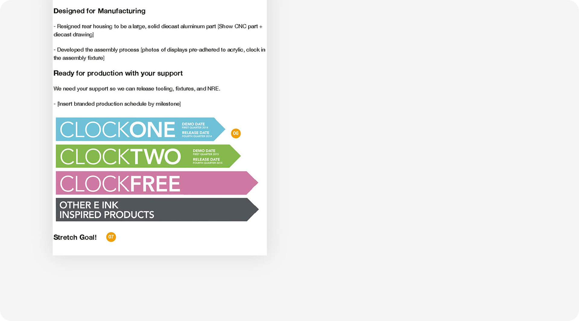
06 Focus release dates for this product instead of future proposed products
07 Questions: Will there be a stretch goal product? Will there be price point rewards?
06 Focus release dates for this product instead of future proposed products
07 Questions: Will there be a stretch goal product? Will there be price point rewards?
Final Design - Kickstarter Webpage Part 1/2
Final Design - Kickstarter Webpage Part 2/2
Final Design - Kickstarter Webpage
RESULTS FROM THE UPDATED KICKSTARTER WEBSITE INCLUDED:
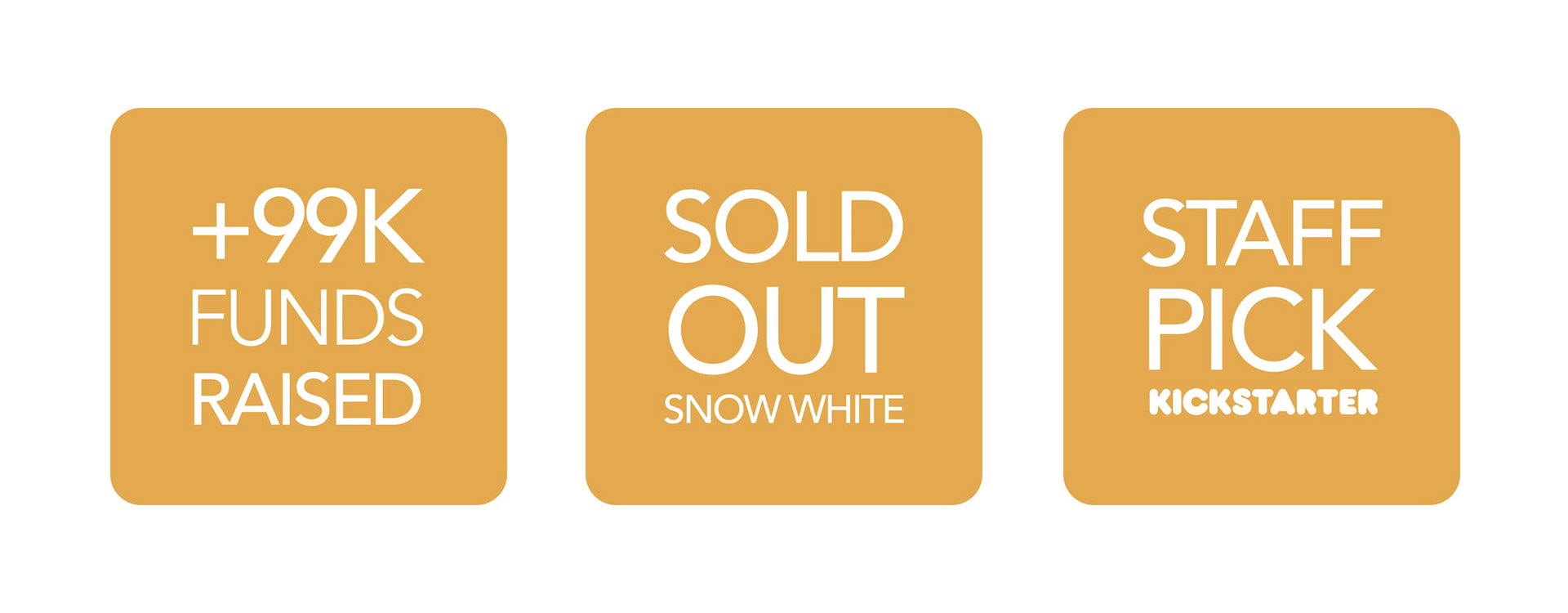
>>> 260 backers in 30 days for a total of $99K pledged
>>> ClockONE being chosen as a Kickstarter Staff Pick
>>> 260 backers in 30 days for a total of $99K pledged
>>> ClockONE being chosen as a Kickstarter Staff Pick
Email Blast Design Concepts
LEAD OFF WITH WHITE - CLOCKONE "SNOW WHITE"
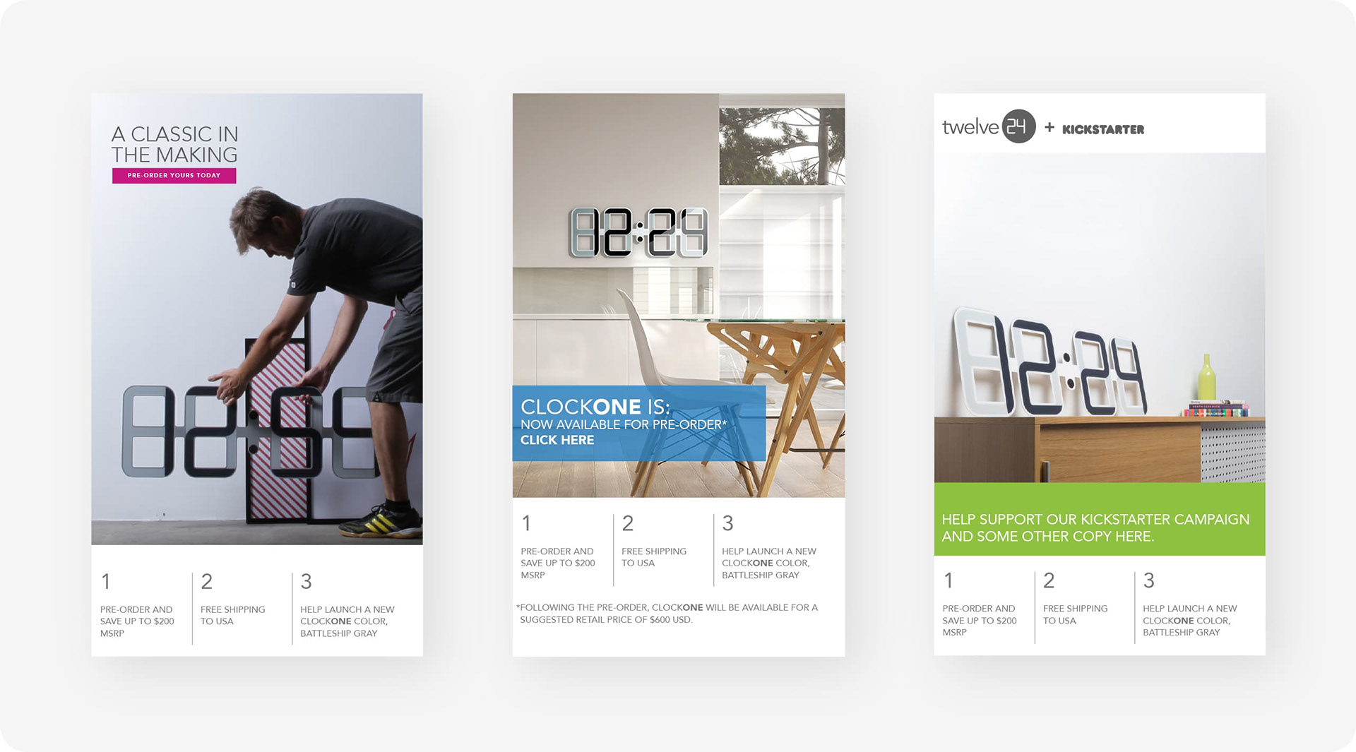
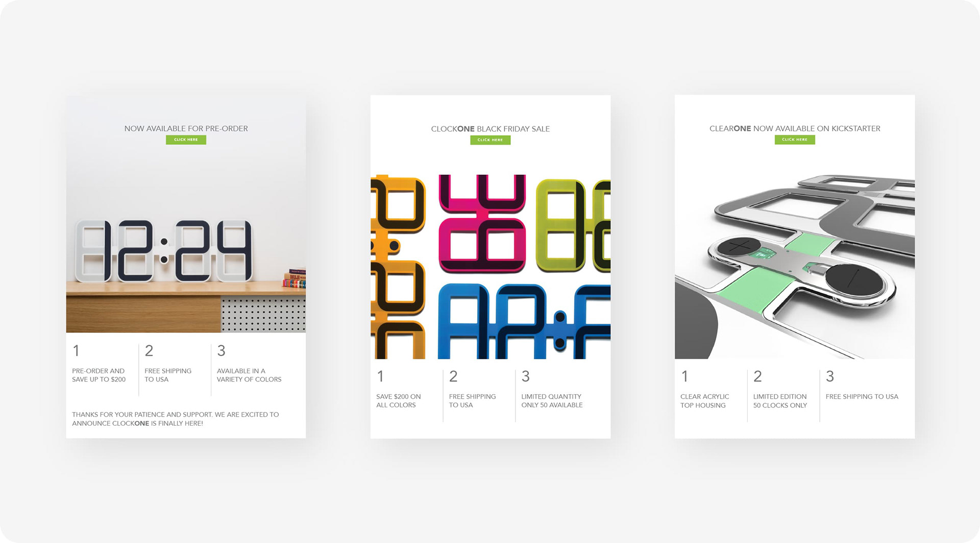
The first ClockONE color-way was white, AKA “Snow White”. This was the first email blast sent out to announce ClockONE pre-order availability.
The first ClockONE color-way was white, AKA “Snow White”. This was the first email blast sent out to announce ClockONE pre-order availability.
idea 01 "SNOW WHITE" CONCEPTS
01A Behind-the-scenes industrial maker look
01B Lifestyle brand with contrasting color block overlay CTA
01C Product logo + Kickstarter branding with color block below
01A Behind-the-scenes industrial maker look
01B Lifestyle brand with contrasting color block overlay CTA
01C Product logo + Kickstarter branding with color block below
Email Blast Design Concepts cont'd
GO BOLD WITH BRIGHTS - CLOCKONE "COLORS"
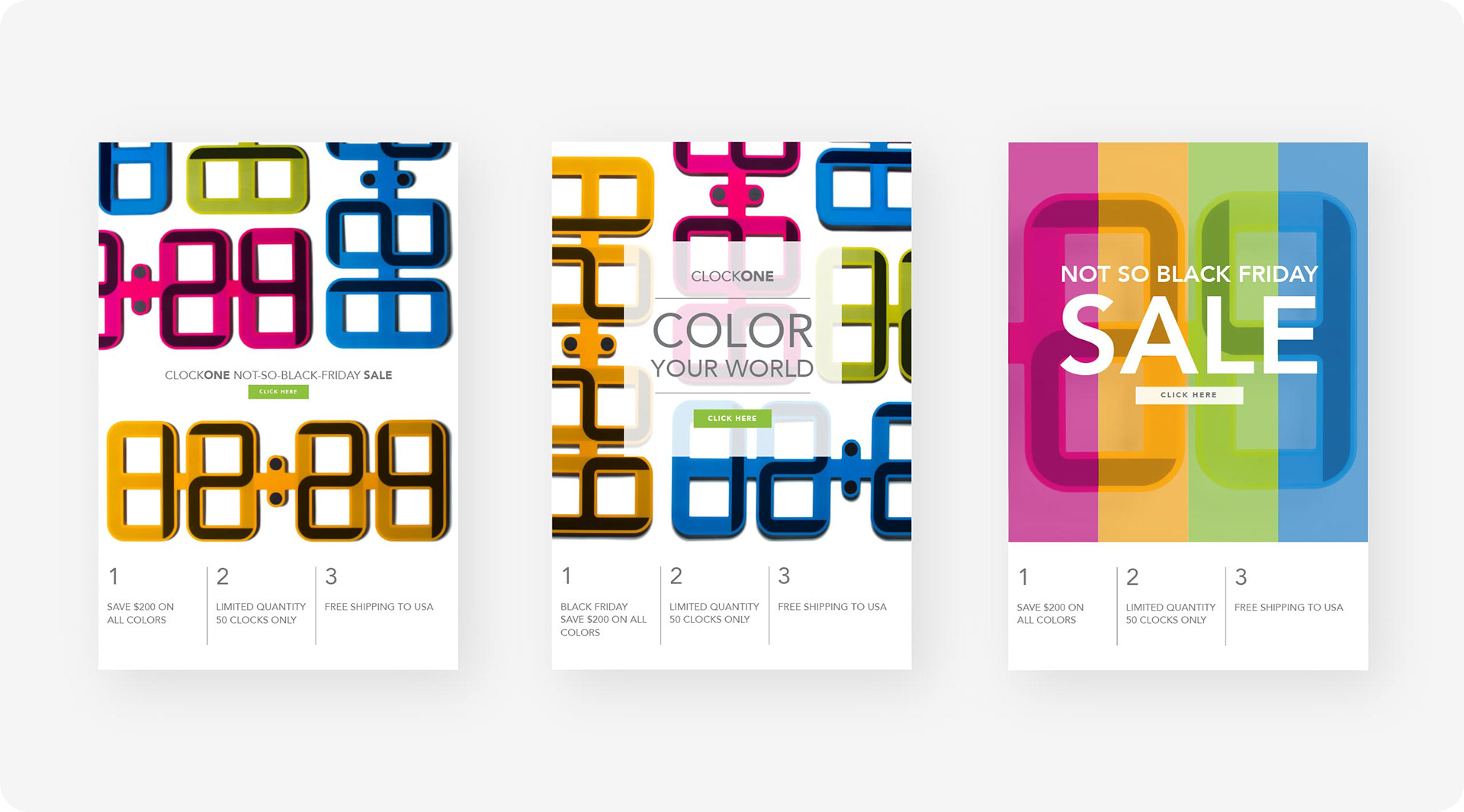
In addition to white, ClockONE also came in four other colors: blue, green, pink and orange. This color-focused email blast was released just prior to one of the busiest shopping days of the year - Black Friday.
In addition to white, ClockONE also came in four other colors: blue, green, pink and orange. This color-focused email blast was released just prior to one of the busiest shopping days of the year - Black Friday.
idea 02 "COLORS" CONCEPTS
02A One of several versions of the multi-clock “mosaic” concept
02B Multi-clock mosaic with white box + text overlay
02C A more abstract design experiment with color bars and white type
02A One of several versions of the multi-clock “mosaic” concept
02B Multi-clock mosaic with white box + text overlay
02C A more abstract design experiment with color bars and white type
Email Blast Design Concepts cont'd
INNER WORKINGS - CLOCKONE "CLEAR"
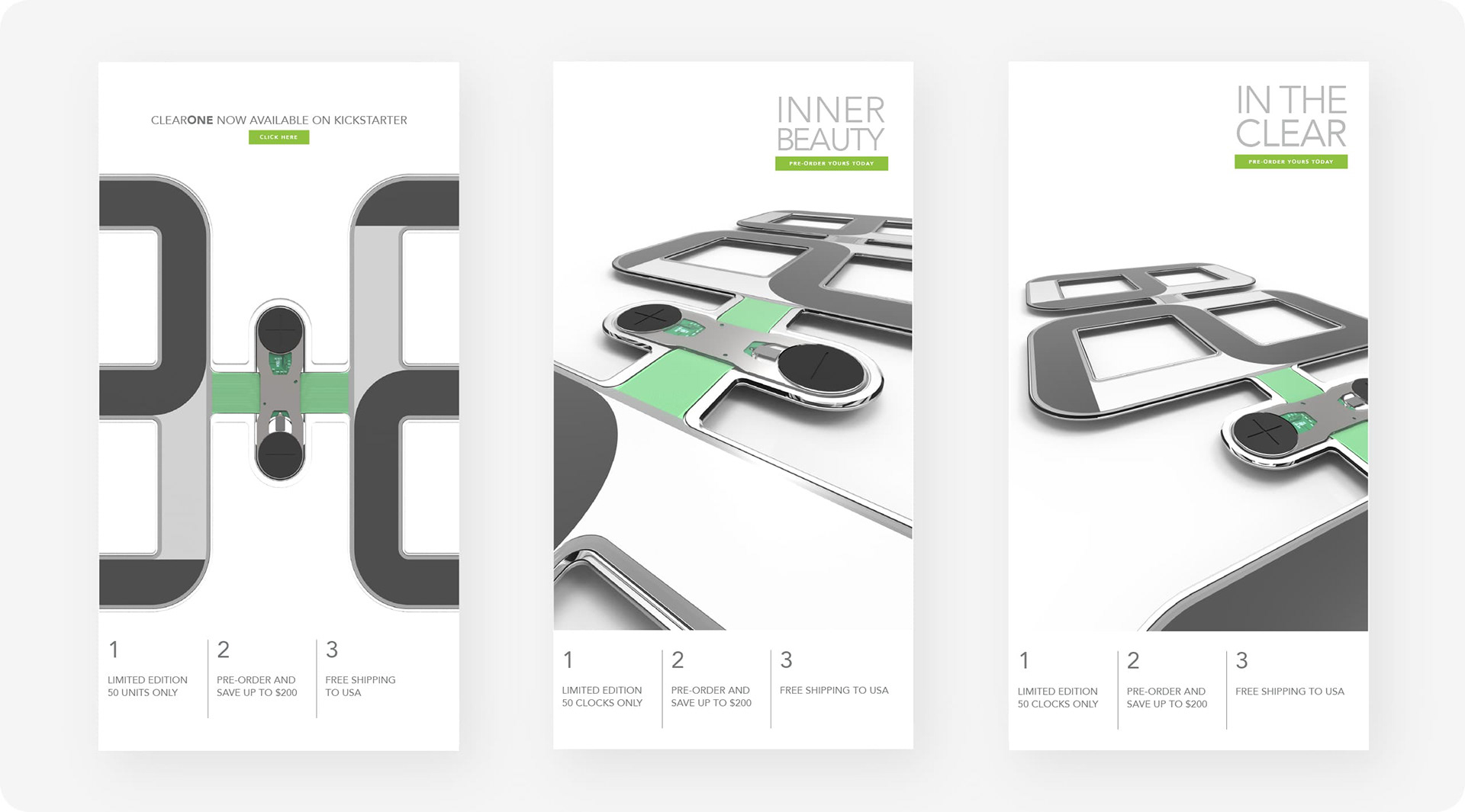
As a limited edition release, the industrial design team designed a see-through version of ClockONE.
As a limited edition release, the industrial design team designed a see-through version of ClockONE.
idea 02 "CLEAR" CONCEPTS
03A Cropped front view
03B/03C Dramatic angle product shots with clarity themed copy explorations
03A Cropped front view
03B/03C Dramatic angle product shots with clarity themed copy explorations
Final Email Blast Designs
ANNOUNCING UPDATES TO EMAIL SUBSCRIBERS
To keep potential buyers in-the-know, the following emails were sent at key intervals.
To keep potential buyers in-the-know, the following emails were sent at key intervals.
FINAL DESIGNS - USAGE
01 First blast - the initial launch of the ClockONE Kickstarter campaign
02 Second blast - ClockONE colors released during Black Friday Sale
03 Final blast - ClockONE Clear released as a special limited edition option
01 First blast - the initial launch of the ClockONE Kickstarter campaign
02 Second blast - ClockONE colors released during Black Friday Sale
03 Final blast - ClockONE Clear released as a special limited edition option
Google Banner Ad Design Concepts
DESIGN IDEA HIGHLIGHTS
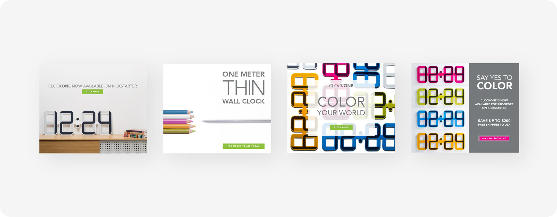
01 Lifestyle branding image with ClockONE atop a minimalist modern credenza
02 Promoting product thinness plus an abstract reference to ClockONE colors
03 White box overlay with top down view of clock “mosaic”
04 Frontal views + a vertical side bar which could accommodate more copy
01 Lifestyle branding image with ClockONE atop a minimalist modern credenza
02 Promoting product thinness plus an abstract reference to ClockONE colors
03 White box overlay with top down view of clock “mosaic”
04 Frontal views + a vertical side bar which could accommodate more copy
Leaderboard Banner Ad Studies
COLOR STORIES AND THE SIMPLICITY OF WHITE
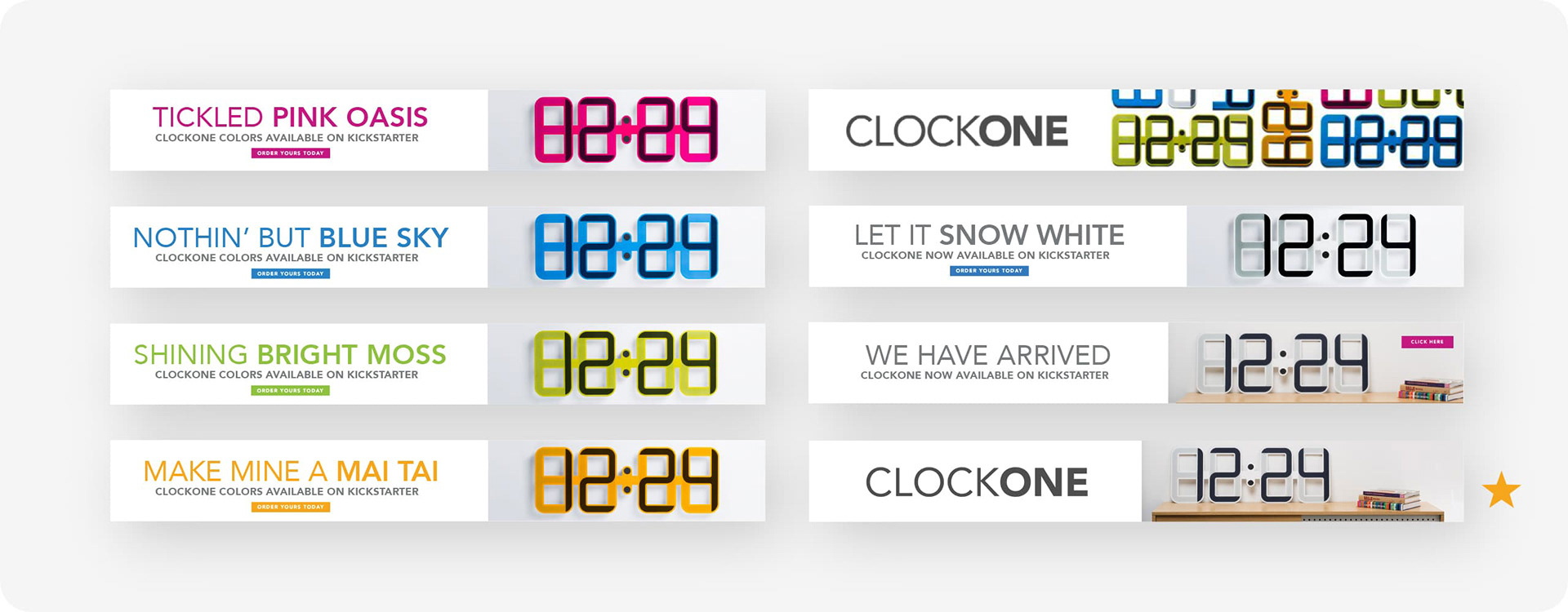
Concepts included a fun play-on-words approach with color names e.g. "Pink Oasis" and "Blue Sky" as well as more straightforward and minimal brand-only layouts.
Concepts included a fun play-on-words approach with color names e.g. "Pink Oasis" and "Blue Sky" as well as more straightforward and minimal brand-only layouts.
CHOSEN DESIGN DIRECTION
In the end, as "Snow White" was leading in pre-sale orders, the above layout [as indicated] was chosen.
In the end, as "Snow White" was leading in pre-sale orders, the above layout [as indicated] was chosen.
Conclusion
project Outcome
ClockONE garnered many positive press reviews from various outlets: CNET, Brit + Co, GQ, Dwell magazine. And even received a Best of Year Finalist Award from Interior Design Magazine. Unfortunately, the funding goal was not met so ClockONE was never manufactured.
ClockONE garnered many positive press reviews from various outlets: CNET, Brit + Co, GQ, Dwell magazine. And even received a Best of Year Finalist Award from Interior Design Magazine. Unfortunately, the funding goal was not met so ClockONE was never manufactured.
FINAL THOUGHTS
Of course it’s saddening and somewhat disheartening when a project you worked so hard on doesn’t come to fruition. But the variety of deliverables I got to design [in addition to those mentioned in this case study] was a real treat: product packaging, trade show booth displays and graphics, postcards, t-shirt graphics, copywriting and presentation layouts for design competition submissions.
Of course it’s saddening and somewhat disheartening when a project you worked so hard on doesn’t come to fruition. But the variety of deliverables I got to design [in addition to those mentioned in this case study] was a real treat: product packaging, trade show booth displays and graphics, postcards, t-shirt graphics, copywriting and presentation layouts for design competition submissions.